Welcome to the first entry in my Bad UI series, where I’ll look at widely used products that should be better than they are.
I’m starting with the YouTube iOS app, not because it’s the worst interface in the world, but because it may be one of the most revealing. YouTube is not a scrappy startup trying to ship an MVP before the money runs out. It belongs to Google. It runs on one of the most mature mobile platforms in existence. It has an enormous user base, endless telemetry, and armies of engineers.
And yet, somehow, the app still feels like an app assembled and maintained by people who don’t actually use it.
The Awkward Half-Dismiss Gesture
Let’s begin with one of the oldest offenders: the gesture for semi-dismissing a playing video.
On iOS, you can swipe the playing video diagonally from the upper-left toward the lower-right to shrink it down and keep browsing. Technically, it works. Practically, it has always felt awkward.
It is not a natural movement. It does not feel discoverable. It does not feel like something designed around the ergonomics of a phone in one hand. I remember assuming YouTube would eventually replace it with something cleaner and more intuitive.
Instead, it stayed.
That is often how bad UI survives. A strange interaction ships, users grudgingly learn it, metrics say people are using it, and the team mistakes adaptation for approval.
The Watch Later Stutter
The app also lacks polish in places where polish should be easy.
Take a long Watch Later list. As you scroll, the list can stutter while the app fetches metadata for the next batch of videos. This feels especially unnecessary because the app does not need to eagerly load everything. It could fetch the full list of video IDs, titles, and counts up front, then let thumbnails and richer metadata fault in as needed.
That would make the list feel stable and responsive. Instead, you get little pauses that remind you the machinery underneath is not particularly elegant.
This kind of thing matters. Performance is part of interface design. A stuttering list tells the user, “You moved faster than we expected.” Good software should not scold you for scrolling.
The Six-Year One-Line Bug
When I worked at Google, I filed a bug about swiping videos in the Watch Later list and tapping the trash can that appeared. The problem was that the trash can would then appear out of nowhere on other videos in the list.
The cause was obvious (to a seasoned software engineer) and mundane: the app was reusing list tiles and failing to reset them back to their default state. In other words, a classic cell reuse bug.
I filed that bug in 2018. Over the years, I received automated emails asking whether the bug could be closed, presumably because someone hoped it had been fixed by accident. I kept responding that it had not.
It finally got fixed in 2024.
Six years.
To get a one-line fix.
That is not a technical problem. That is a culture problem.
The Latest Regression: The Video Progress Bar
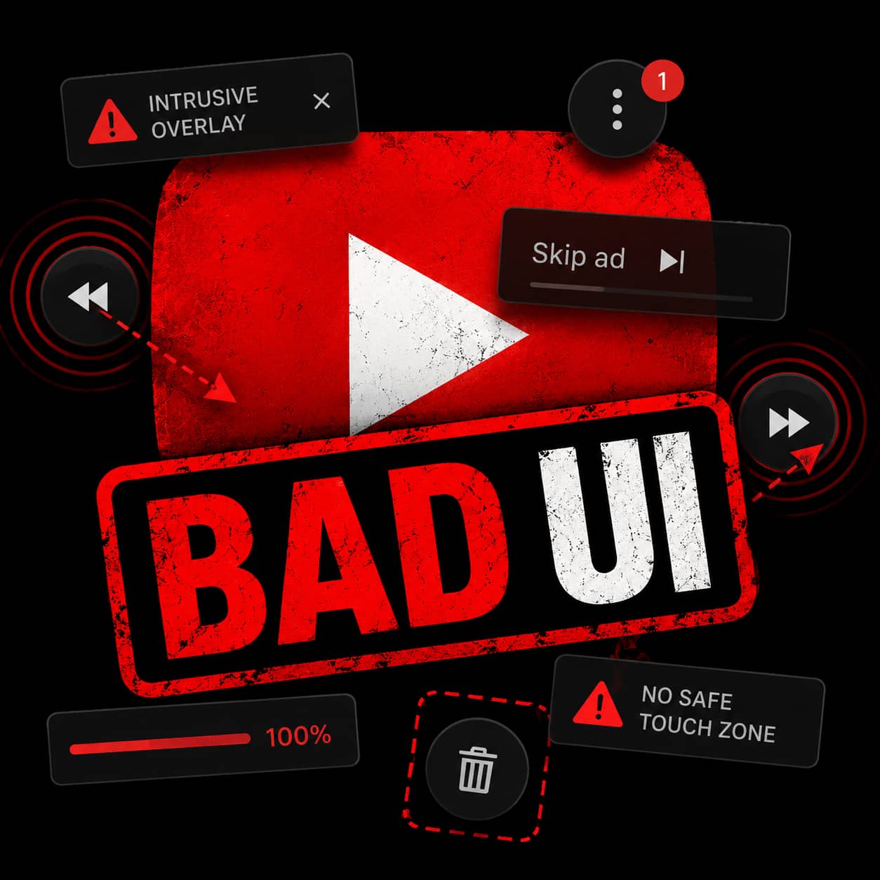
The latest bug involves video progress bars. YouTube thumbnails show a small bar along the bottom to indicate how much of a video you’ve watched.
Useful feature.
Except now, in Watch Later, videos I have only watched for a few seconds can show as 100% complete. The result is that partially watched videos look finished, which defeats the entire purpose of the indicator.
This is exactly the kind of regression that should get caught immediately by anyone who uses the app. It is also exactly the kind of regression that makes users lose trust. When interface signals lie, the interface stops being helpful and becomes noise.
The Ad Interruption “Thumb”
Then there is the newest landscape-mode annoyance.
When an ad interrupts a video and playback resumes, a mini menu thumb appears over the content. I’m not even sure what to call it, which is part of the problem. It just shows up and gets in the way.

For someone optimizing ad surfaces and engagement mechanics, maybe this looks clever. For someone trying to watch a chess game, it obscures the board. That is not clever. That is hostile.
A video app has one sacred responsibility: do not cover the video unless absolutely necessary.
No Safe Place to Touch
Another recurring problem: the entire screen behaves like an active UI surface.
There is no safe place to grab the phone. No dead zone. No neutral area where a thumb, palm, or stray finger can land without triggering something. If the video is playing and I pick up the phone, shift it in my hand, or set it down, a brush against the edge of the display can fast-forward the video, rewind it, switch to another video, reveal controls, or otherwise interrupt what I was watching.
That may sound minor until it happens for the hundredth time.
A good mobile interface understands that phones are physical objects. People do not interact with them only through deliberate, perfectly aimed taps. They carry them, rotate them, adjust their grip, hand them to someone else, and pick them up while distracted. The UI needs to distinguish intent from incidental contact.
The YouTube app often does not.
This is especially frustrating in landscape mode, where the phone is more likely to be handled by the edges and where accidental touches become easier. When every pixel wants to do something, the interface starts to feel jumpy and fragile. It stops serving the viewer and starts demanding constant caution.
A video player should not make me handle my phone like I am defusing a bomb.
Scale Is Not an Excuse
The YouTube iOS app is not unusable. Most of the time, it does the basic job. But that may be why its problems bother me so much. This is not a tiny product struggling under impossible constraints. This is one of the most important media apps on the planet.
Bad UI at this scale does not happen because no one is smart enough to fix it. It happens because the organization stops caring about the right things. It optimizes what it measures. It tolerates regressions. It lets small irritations accumulate until users assume the rough edges are permanent.
The YouTube iOS app UI should feel world-class. Instead, too often, it feels neglected.
And that is embarrassing.
Jayson L. Adams is a technology entrepreneur, artist, and the award-winning and best-selling author of the science fiction thrillers The Quantum Mirror, Ares, and Infernum.
Jayson writes sci-fi thrillers that explore what extreme situations reveal about who we really are. His novels combine high-stakes science fiction with deeper questions about identity, courage, and human nature. You can see more at www.jaysonadams.com.